
Why design systems are a single point of failure
Tools and techniques to prevent design system collapse
Two years ago left-pad broke the most popular sites on the web. left-pad was a 17 line utility that countless software projects depended on. When it disappeared from the NPM package registry, it triggered an avalanche of build failures in thousands of libraries affecting teams at Facebook, Netflix, and Spotify.
A single point of failure is a piece of a system that can cause the entire system to stop working if it fails.
Design systems rely on the same underlying principles that made the left-pad fallout possible. As designers and frontend developers, we can be so caught up in evangelizing UI consistency that we become blind to the single point of failure in front of us.
This article talks about why design systems collapse (specifically the UI components) and how maintenance stops that from happening.
A double-edged sword
Design systems make it cheaper to deliver consistent UIs by reusing components. The mechanism that unlocks these benefits is equally effective for delivering defects.
The architecture of a modern app looks like a chain of dependencies, where larger composite components (pages) rely on smaller reusable components (buttons, inputs, etc.). When small components change the composite components that rely on them also change.

A design system scales this model to an organization. It enables sharing common components between apps by centralizing them in one place. Since design systems are really just another dependency, when system components change so do the dependent apps.
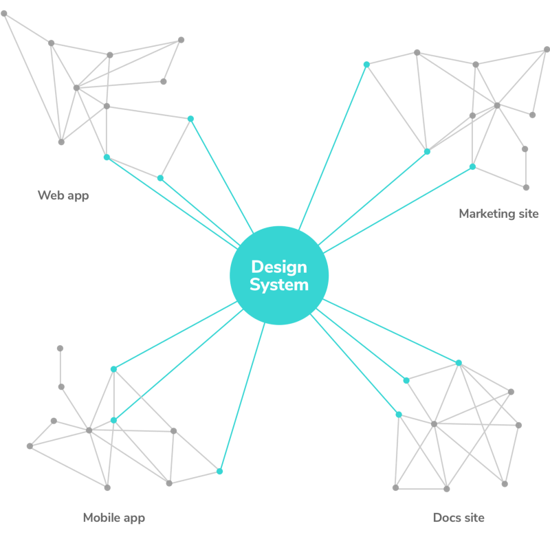
A bug in a button affects every usage of that button across apps. What’s more, factors unique to software amplify the impact of UI defects:
- Chain reactions: Interwoven dependencies mean small changes snowball into countless regressions.
- Move fast and break everything: Continuous deployment accelerates shipping user-facing updates. UI regressions slip through the cracks when QA time contracts.
- Difficult to debug: App complexity is skyrocketing prompted by trends toward personalization, state on the client, and responsiveness. The result is prolonged debugging time and increased chance of introducing bugs.
In design systems minor tweaks cause major bugs that are quick to deploy and hard to debug.
Maintain design systems
Despite the considerable risk of design systems there is no turning back. The value of deploying UI at scale is evident. Companies now invest hundreds of thousands to millions of dollars creating design systems. Yet methods to protect these investments remain prehistoric.
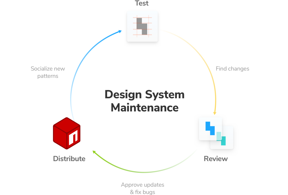
Defects undermine the fundamental value of design systems by introducing regressions at scale. They cannot be efficient if bugs distract your team. Maintenance is the only way to proactively catch these defects. Let’s walk through the most effective tools and techniques.
Test UI components
Applications are more complex than ever in both appearance and functionality. Visual snapshot testing and unit testing UI components help ensure that your design system is durable in the face of constant software change.
Visual snapshot tests for appearance
Visual snapshot testing (a.k.a., visual regression testing) ensures your UI looks the same each time you push code. For example, a CSS tweak is liable to cause unintended consequences. With visual snapshot testing you can automatically identify these consequences and fix them before shipping.
To test a design system capture screenshots of every UI component in each state and compare them version-to-version to surface changes.

For most teams, visual snapshot testing is a high-value and low-effort first line of defense against UI regressions. Learn how to test UI component appearance:
- 👁 Visual testing by Tom Coleman — Get started visual testing UI components
- 🏗 Visual test-driven development by Tom Coleman — See the visual testing development workflow for app teams
- 🔍 Visual regression testing services list
Unit tests for functionality
Unit testing verifies that components return correct outputs when supplied with consistent inputs.
Components range in functionality from simple buttons to elaborate date pickers. As components become more intricate it’s harder to capture interaction patterns using only visual snapshot tests. Unit tests, small tests that live alongside the component, help you confirm specific component functionality.
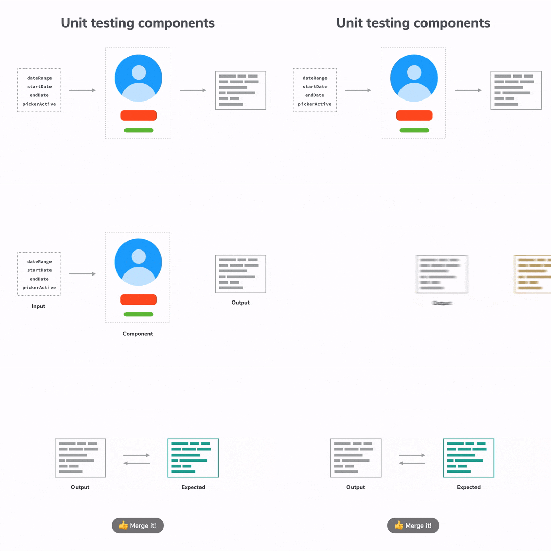
In the case of design systems maintenance, unit tests complement cost-effective visual snapshot tests to verify nuanced functionality. Learn more:
- 📋 Testing React components with Jest and Enzyme by Artem Sapegin creator of Styleguidist
- ☑️ Testing React Components by Ovidiu Cherecheș creator of Cosmos
Review changes and additions
Maintenance cannot end with testing alone. Tests ensure that UI doesn’t change by accident. But design systems are dynamic; UI patterns must adapt alongside user needs. Workflows to review changes with collaborators help your design system evolve.
Integrated review workflow
There is a human element to maintenance. Running visual snapshot or unit tests merely surface incongruences, you still have to manually determine if changes are intentional (updates) or unintentional (bugs).
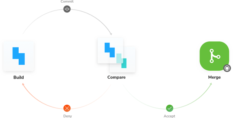
The approval workflow sits between automated tests and your component library –acting as a filter to ensure only good stuff makes it into the library.
When integrated with code hosting and continuous integration tools it becomes a seamless part of the design system workflow:
- Push code to the design system repository
- Visual snapshot & unit tests automatically surface changes (from the previous version of the code).
- Review: accept or deny changes
- Accepted changes get merged into the design system
Collaborative review
Design systems are an internal product whose “users” are other teams. Collaboration is essential because there are so many stakeholders.
There are plenty of ways to encourage collaborative review, from weekly meetings to documentation sites. Given that design systems are often inter-disciplinary efforts involving many teams, the industry consensus centers on asynchronous collaboration.
A popular technique uses a living documentation site as the source of truth. When there are design system changes, the documentation site is updated. Teams then reference the site as they discuss changes in project management or chat tools. Checkout Major League Soccer’s review process:

Distribute the latest UI components
In the review step, you approved improvements and fixed bugs found during testing. Now it’s time distribute these updates to dependent apps via a package manager. There are a few popular ways to package your design system, I’ll break them down below.
As a whole
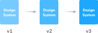
The simplest way to distribute a design system is in one piece. This often takes the form of a single versioned package that maps to a single repository containing the UI components. Teams at Lonely Planet, Wix, and IBM Design use this method.
Piece-by-piece
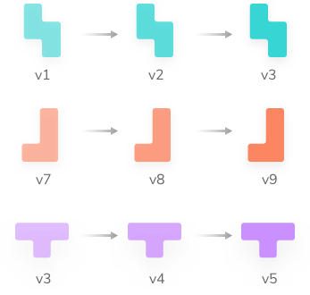
Updating a whole design system at once can be impractical for teams due to the risk of regressions. Some teams opt to distribute each component as an individual versioned package. AirbnbEng and Atlassian distribute Rheostat, Dates, beautiful-dnd(drag and drop) like this.
Why not both?
Using open source tools like Lerna, maintainers can manage the design system from one repository while still allowing apps to use precise component versions. It’s a synthesis of the methods mentioned above. Developers at Pluralsight, ANWB, and Healthcare.gov use this method.
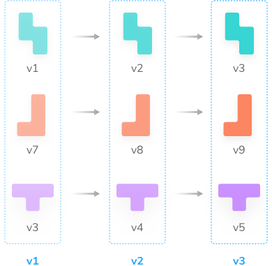
There is no right way to package up UI components. As you can see, even established teams rely on different methods. The point is to package and version your design system so that dependent apps can benefit from improvements (and roll back defects if needed).
Conclusion
Design system maintenance boils down to a smart testing strategy, review tools, and distribution. This virtuous cycle helps prevent regressions from propagating throughout the entire system –the classic pitfall of a single point of failure. You get the confidence to ship improvements without worrying about stowaway bugs.
Digital defects spread far and fast in design systems. Maintenance can’t be an afterthought because accidents affect all users. In fact, maintenance allows companies to fully realize the upside of design systems by mitigating the downside.
I hope the recommendations here jumpstart your maintenance strategy. There are a wealth of free libraries and decisions to make ahead! If your team would prefer an instant-setup cloud tool for design system testing and review checkout Chromatic (made by yours truly).